

Wednesday, February 17, 2016
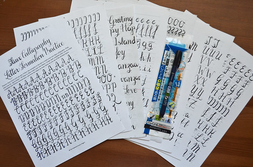
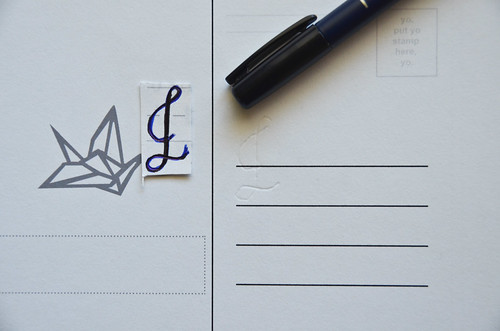
Awhile back I took a calligraphy class from the Pittsburgh Center for the Arts as a means of getting myself out of the house. I never posted much about it here, because what I was accomplishing was a rather simple, incremental skill with a dip pen. Dip pens are fun. But there's also a decent amount involved with them. You know what's also fun? Tombow Fudenosuke Hard Brush Pens. Instead of relying on the natural shape of the pen to give you thin upstrokes and thick downstrokes, you have to apply the pressure downwards as you write. It's trickier, but a bit more approachable.
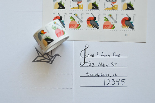
I wanted to apply this to some postcard addresses, but hadn't any experience with copperplate calligraphy. So I purchased a Postman's Knock Amy Style Calligraphy Workbook (free introductory worksheet, here). And despite a week of intense practice, I never got to a point of confidence freehanding, without a guide to trace over. And so, what was a girl to do?
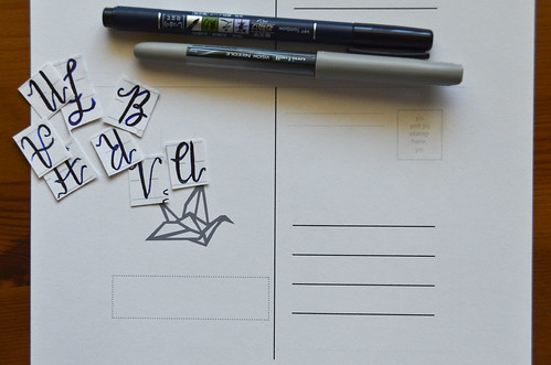
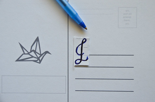
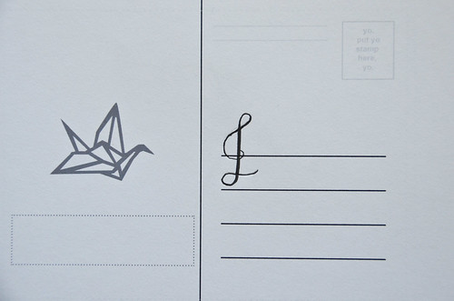
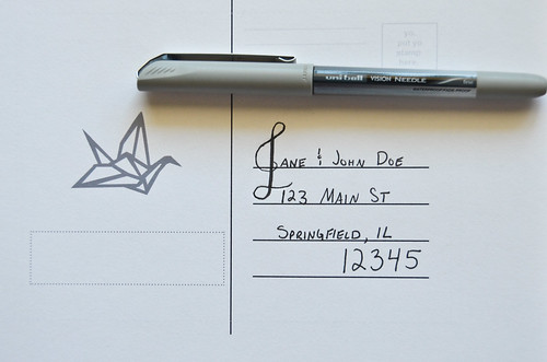
This tutorial is my solution: one capital letter in the fancy calligraphy script traced, and the rest of the text in small caps. It's pretty simple. Still requires some practice and a bit of preparation, but it yields a pretty simple, almost fancy address in the end.


0 comments:
Post a Comment