Wednesday, November 16, 2016
There's currently a lot of wedding website & RSVP hosting options! Here's a bunch that we looked at and some brief notes on their pros/cons:
- No website - It’s not a requirement!
- Appy Couple - Has a “smart RSVP” system that’s password protected or something, and supports multiple RSVPs at varying privacy levels. $40 or $90, depending on which design option you want. Even has some paper invitation designs that match your website. Design is a tiny bit clunky, and all designs have pretty much the same layout, with a couple different color options.
- Riley & Grey - Lovely designs with matching paper invitations ("branding" *shudder*). Nice RSVPs, etc. etc. Pricey: $35/month or $240/year
- GloSite is a wedding website on drugs. Provides a virtual invitation that guests can open online, in case you’ve done away with traditional invites. Handles complicated (multi-event) online RSVPS and all sorts of other nonsense. $140/year ($25-$30/month).
- GreenVelope - Similar to GloSite (customizable e-paper invites + RSVP + website with details). Ranges in price from $60-130, plus additional fees for customization ($29 to change colors, bleh). Wedding website looks a little more Facebook-event-ish than you might want. Overly animated, might be risky for older computers.
- Wedding Window - Has free and premium options, including online RSVP (although, premium says something about linking your guest list to the RSVPs). Premium also has e-Invitations, if you’re considering skipping paper Invites. Premium is $15/month ($80/year). Wedding Window feels more like a generic website editor turned wedding manager, AppyCouple is likely preferable.
- RSVPify - They slap a "powered by RSVPify" on the free version of services. They have a premium service to make them some money, and it's $29.99 one time or $8.99/month. However, they appear to only do the RSVP side of things. Not a full wedding website.
- The Knot provides free wedding websites. Lots of complaints online about their RSVP management system. It’s been terrible for decades.
- SquareSpace has gotten into the wedding website business and they’re an APW sponsor. Lots of nice templates for throwing your own text/photos in. RSVP handling is a pretty basic online form. Prices start at $12/month (~$144/year).
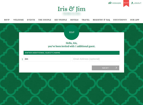
We went with AppyCouple for a few reasons: price ($40), tiered RSVPs (i.e., can invite someone to the wedding reception, but not to the pre-ceremony photos), decent design, full wedding website (i.e., RSVPs, hotel info, travel info, etc.) and it has multiple privacy settings (i.e., password protection). After signing-up, I really liked that I could see who opened which emails sent by the system (i.e., the invitation, the events email, the hotel block email, etc.) and who had logged-in to the system and when. It really helped us figure out who needed to be contacted for some guidance.
AppyCouple also requires minimal design ability, as all their 'designs' have the exact same layout (this is either a good or a bad thing, depending on how 1337 you are). J and I are not very leet, and so we were fine with AppyCouple.
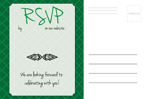
AppyCouple mostly performed admirably, except for a few minor issues:
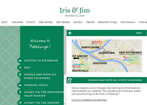
- Many people did not realize there were other pages with public/informal events or hotel blocks listed on the website. They basically just RSVPed and then left. I had to have the system send out a separate email reminding people about the hotel blocks, and another email listing all the public events.
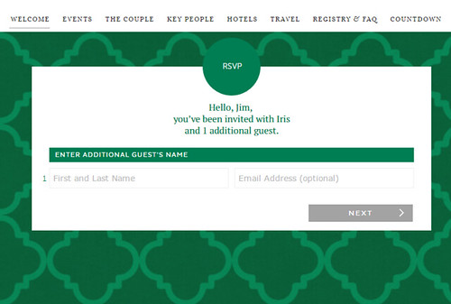
- People given an unnamed +1 struggled with the RSVP interface. I think some guests who were given an unnamed +1 didn't realize that clicking through an email link automatically logged them into the system under their name and that 'Additional Guest's Name' meant that they were permitted a guest. At least three people put in their own name as their additional guest's name.
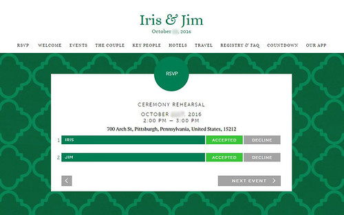
- At first the RSVP pages simply provided the name of the events (Ceremony Rehearsal, Family Photos, The Wedding, etc.) but not the times or locations. Which would mean that guests would have to flip back and forth between the RSVP page and the events page. An email to the AppyCouple team, and they added in the where/when details for us!
- Upon first visit of our wedding website via the app, the main image was slightly off-center. But after reloading, it would appear centered. We contacted the AppyCouple team and they may have fixed it, I don't know. Such a small detail it doesn't matter much.

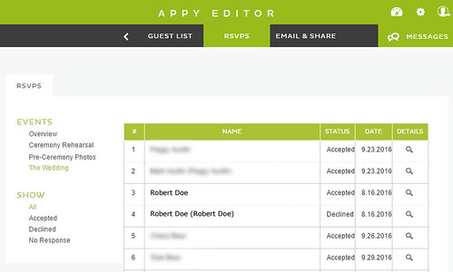
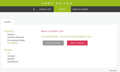
- Lots of people RSVPed by word of mouth instead of via the system. It wasn't difficult to manually enter people's RSVPs from the system, so this wasn't exactly an issue, but happened with about 10/65 of the invited households.
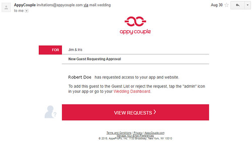
- When people attempted to log-in to the website with a nickname, the system did not recognize them. To get into the website you needed (1a) a name on the list and (2) the password or (1b) just a link emailed by the AppyCouple system. If your name was listed as 'Robert Doe' and you sign-in as 'Bob Doe', the system would email J & me and ask us to manually approve your access. Likewise if your name was stored as 'Patty Doe' in the system and you signed in as 'Patricia Doe.' Not a big deal, as the manual-approval process was set-up for this, but it did happen about ~3 times and could have been easily avoided with some pre-emptive programming. In AppyCouple's defense, if guests clicked the link in a system-sent email, then the guests would be automatically logged in and there would be no need to enter the guest's name.
- We encountered some slight differences in wedding website mental models. That is, some people thought the website was just for RSVPing to the wedding/reception, not for also disseminating other details like when family should show for group photos. This just meant that there was a slight delay in some people viewing the website, resulting in them asking for event details because they did not yet realize that information was already available.
- There was no page option for a FAQ, so we had to add some 'Registry Note' widgets to the registry page, and re-title that as 'FAQ'. A bit clunky, but it works.
Overall, we were pretty satisfied with AppyCouple. The price was right, it had the features we needed, and the tech team was pretty responsive. I would make the same decision again.


1 comments:
One of the most useful wedding posts you can find online. Most popular websites encapsulated to help you create your wedding checklist. In these days, there are just too many tools out there. That's why you should do your research before paying for it. There might be a very similar and free version available. For instance, if you'd like to use an online tool for your guest management and creating a seating chart, this free and awesome table planner can help you save money. It's completely free for event planners.
Post a Comment