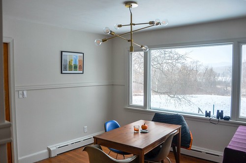
The dining room was the first room we face-lifted and it is just a breath of fresh air, even without all the new furniture it needs. Even with a giant dog crate in the corner. Here, let me show you:
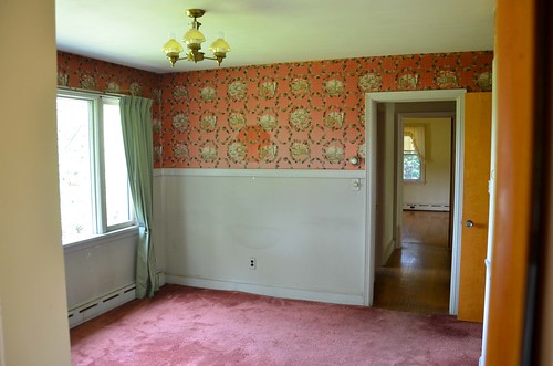

Chipping paint, radiators with exposed metal peeking through. Faded wallpaper showing the location of artwork that hung in the same location for 70 years. Stains on the wallpaint where furniture rested against it...This is
every room in this house. A little bit of paint and a lot of elbow grease really goes a long way with each room we touch. Even if we don't yet have the furniture to fill it!
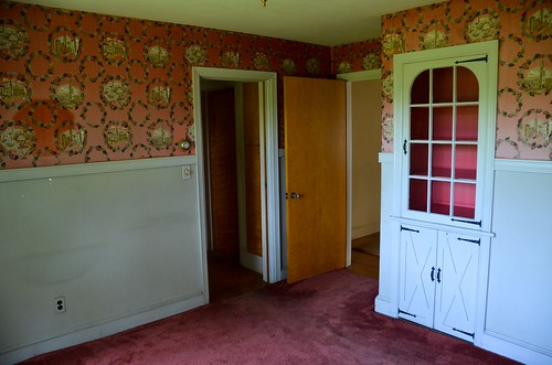
We start with the arduous task of removing the wallpaper- this stuff is
really stuck on - it takes a wallpaper tiger to score the paper, then fabric softener + vinegar + dish soap in steaming hot water, soak the wallpaper for 15 minutes with a sponge, then scraped with a sharp metal putty knife and even then it only comes down in 4x6" pieces. The process is
slow. Then we scrub the walls with TSP, scrape at chipping paint, sand, spackle, sand some more. Prime with Zinsser Bullseye, sand again, paint the ceiling x2, paint the trim x2,
cut-in the edges by hand x2, roll paint onto the walls x2, and then repeat the whole process for any windows or doors in the room. Eventually, once the paint has cured for ~48 hours, I get to hang artwork, and J switches out all the outlets, grounds them properly, and replaces light fixtures as needed (very, very needed in this room).
This room, and every room, needs a lot more attention to furniture. The dining room will get a handmade trestle table, and likely some shiny modern chairs. But first thing's first. The paint.
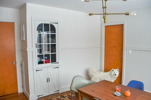
Walls and trim are Benjamin Moore 'Classic Gray' (Regal Select) in an eggshell finish. We just ignored the extra tall chair rail in here, and painted everything the same color and finish. It's a small room, I didn't want to make it feel smaller than it already is! I like the Classic Gray paint in this room, although, with all the natural (northern-ish) light it gets, it can appear washed out to pure white. But after the busy-ness of that magenta wallpaper, warm white/gray feels clean and fresh to me.
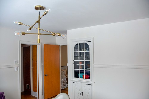
Ceilings are Zinsser Stainblock Ceiling Paint in flat bright white (straight out of the can), which appears to perform okay. It does require at least two coats for full coverage. The built-in cabinet is painted Benjamin Moore 'Hale Navy' (Regal Select) in an eggshell finish. Light fixture is
West Elm's large mobile chandelier. The print is
PopChartLab's 'Birds of North America' poster. A lot of bird watching gets done in this room.


3 comments:
2 comments:
1. ooh I like that chandelier a lot! (Sorry I know this is not the point of your post at all :)
2. and, well painted! we have had the same problem now that we are HOMEOWNERS too; many rooms like this that we have had to turn into this. (And by "turn into" I mean "pay people to turn into.") Anyway, I agree about the warm white/gray.
Ooooh that built-in is dreamy. The paint (and lack of wallpaper) make it look like a completely different room!
Wallpaper is The worst - I do like what you've done with the room. Also pup has gotten so big already!
Post a Comment