Wednesday, July 17, 2013
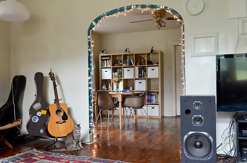
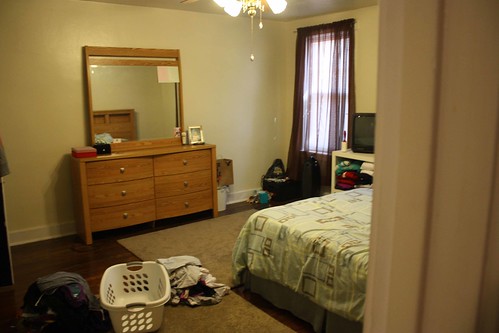
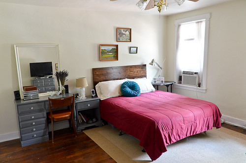
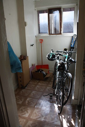
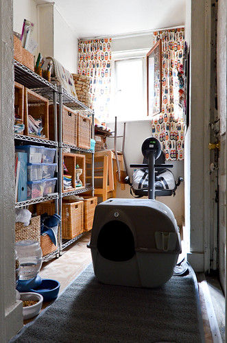
It's kinda amazing how different one apartment can look when it has two different residents. Here you can see a little retrospective of what the apartment looked like when I first viewed it (see: red curtains), compared to what it looks like recently (see: whiter lighting). It's tricky to view someone else's home and figure out how it will work with all your stuff in it, especially when you have so much more stuff than the current tenant. However, it's hard to go wrong in any space with hardwood floors and this many windows.
Pittsburgh is saturated with all these old steel-era buildings, with the kind of accents you don't find in modern apartment buildings: stained glass ceilings in the hallways, old school light switches, hardwood floors. Although, along with all these lovely details, we also inherit the not-so-great bits about living in an old apartment. That's probably better off being left open to the imagination.
An entire family probably once lived in this one bedroom apartment, where now two people reside. Although, I'm pretty sure all our crafting & camping supplies count as at least another human being or two!
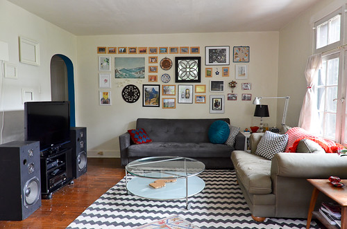

'Here's to seeing potential, where there might not actually be any!
Living Room
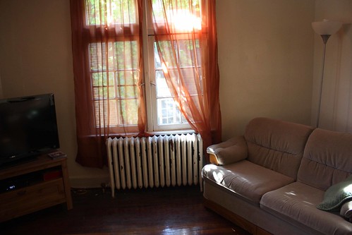
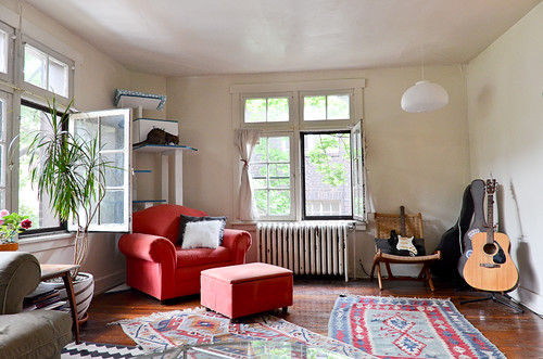
Dining Room
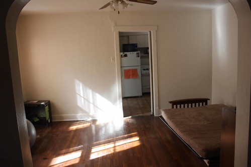
Bedroom
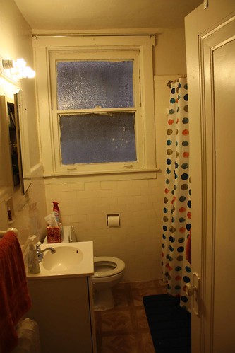
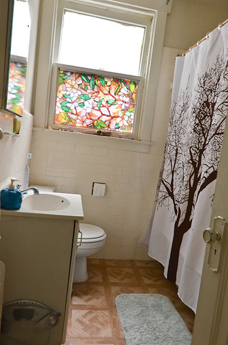
Bathroom
Pantry


13 comments:
Pretty rad... inspiring, even. Appreciate what you've done with the space.
You've done some pretty dang amazing awesome things with that space. The befores all seem awkward and like a poor use of space but in the afters everything fits just right.
I feel inspired to go redecorate everything. You have a great eye. How did you go about expanding the door-frame into the kitchen?
KT - I think there's a slight change of perspective in the two 'dining room' photos that make it look as if I've modified the kitchen doorframe? The old dining room photo is taken from right in front of the curved arch (you can see the curves on the photo edges) while the current photo is taken a few steps back from that spot. So, no permanent modifications. This is a rental, afterall ;)
Wow, your space looks great! I love the natural light and all the fun colors throughout the rooms. I just moved into an apartment and had similar feelings. The previous tenants had painted the walls sloppily in shades of magenta and grey, and the house was packed to the brim with boxes and junk (to be fair, some of it may have been preparing for the move). With newly white walls and the changes in decor we've made, it already looks like a different place.
Wow it looks fantastic, you've done such a good job with it! You kind of make me want to redecorate!
It looks so great! Reminds me of my sister & brother-in-law's place in Pittsburgh. Many similar perks, and I'd imagine some of the same problems as well, ha! :)
Wow, looks great! I thought the same thing about the dining room at first, that you had changed the doorframe. Great job!
To use an overused line, Iris, I love what you've done with the place! I really like all the quirky little arches and how you painted the inside of them blue
Can you come to my house and decorate?
Hey you!!! It is perfectly awesome!!! I love your art groupings and your overall style!!! Such a cool space indeed!!!! Great work!!!
Oh thank god you took over! well done with the claiming it as yer own!!
Wow, gorgeous place! I love that shower curtain. An also all the light coming into the windows (sooo much nicer without red curtains blocking it).
Post a Comment