Friday, December 10, 2021
While the initial inspiration for the kitchen began 10 years ago, much has happened in those ten years. And design decisions need to accommodate the actual kitchen we have, as well as our current needs and capabilities. So, all the ideas spat out below are held to those constraints - things that are logistically and financially feasible for us.

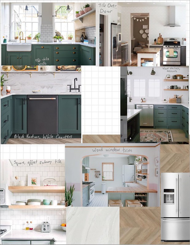
Sources, clockwise from top left: Sustainable Kitchens, The Inspired Room, Jaclyn Peters Design #jpdprojecthwy206, HomeDepot (fridge), Home Depot, Apartment Therapy, Formica, The Happy Tudor, and Bon Appetit.
Paint Colors
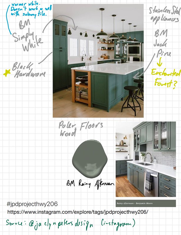
Green Kitchens are having a moment, but I've wanted a green kitchen for 10 years. Popular choices seem to be sage-y greens, seafoam-y greens, or smoke-y greens. Not so much emerald, hunter, or bright green (as in the initial inspiration). I fell in love with a few Farrow & Ball Smoke Green kitchens, so I found a Benjamin Moore similar tone in Enchanted Forest. If I were to choose again, I might go one shade lighter on the same card, to Garden Oasis, just to brighten the lower half of the kitchen up a bit. But when the sun is streaming in, I think the darker Enchanted Forest will look great.
Jack Pine Source: House of Jade Interiors. Green Smoke Source: Sustainable Kitchens. Avon Green Source: Ashley Ray. Scenic Drive source: Caroline Walkup. Garden Oasis Source: Ashley Scott, Scout Modern

Top Source: Jaclyn Peters Design #jpdprojecthwy206. Bottom source: Chad Esslinger Design #cedbarberrycourt.

All paint drop images from Benjamin Moore
Window
And then we have the one kitchen window! It's rather on-trend right now to paint the window sashing and rails black, which I definitely considered. But then I fell in love with several kitchens with wood trim on the windows. So I think we're going with wood on the window, in a natural-ish (or maybe slightly gray) shade of stain. This can match the other wood elements in the kitchen, like shelving and the little folding table next to the stove.
Images sources, clockwise from top-left: Campbells Coming Home, Kate Lester Interiors, Studio McGee, and Apartment Therapy.
Counters
Now, I understand that quartz counters are the "affordable" popular countertop surface these days. However...custom cut quartz counters would just increase our budget by about 50% which is...not desirable. So we decided to just replace the existing worn laminate counters with updated laminate counters from Formica. I pulled out a bunch of the lighter/whiter natural material looking Formica styles, and had J pick which one he liked best. So, white painted marble it is! While the current counters have a very retro metal edging trim, modern formica now had beveled edging strips to match, so it'll look more like a solid surface material. It should be possible to install these ourselves, with some practice. Both The Craft Patch Blog and Hammer and a Headband have DIY tutorials for doing so. While laminate is not the most appealing of materials, it's what's already in the kitchen so it's just in keeping with status quo.

Image source: Formica and Vivi Et Margot.
Hardware
As far hardware, black or brass seemed the best options. We're going with black, specifically 3.5" High Desert Bar Pulls from Wayfair so we don't have to fill in or drill new door holes and probably these 3/8" partial inset hinges (yes, concealed hinges are all the rage, but they're not fiscally feasible for partial inset doors). Partial inset cabinet doors, all the worst features of overlay and fully inset doors, and affordability is the only benefit. When we eventually get to Phase 2 of the kitchen renovation, which involves backsplash tile, I think we'll be going with white square subway tile installed like typical rectangular subway tile, and warm gray grout, as recommended by Young House Love.
Image sources: Home Depot, Wayfair, Home Depot, Floor And Decor, The Happy Tudor.


20 comments:
Great article on kitchen renovation! Love the "BYOV" concept—bringing your own vegetables adds a unique, sustainable twist. It’s a smart way to personalize your space while embracing eco-friendly practices!
Now that you know the fact that the phrase ‘Do It Yourself” is not new to the world of kitchen interior design, you should learn to make cabinets for your kitchen from scratch DIY kitchen cabinets.
Whether you prefer a coastal, farmhouse, or modern look, light blue kitchen cabinets add charm and personality while maintaining a timeless aesthetic.
We just finished our Kitchen remodel Washington DC and it completely transformed our home!
Whether you prefer soft pastels or bold fuchsia tones, decorating with pink kitchen cabinets offers endless possibilities for creativity and self-expression.
With so many options available, selecting the proper cabinets can be daunting. Mid century modern kitchen cabinets, on the other hand, can never go wrong.
Experience hyperbaric therapy Los Angeles style—modern, effective, and tailored to you.
Thanks for sharing these ideas about using marble in interior design.
home renovation Ireland
kitchen renovation Dublin
bathroom renovation contractors Ireland
house renovation services
renovation ideas for Irish homes
eco-friendly renovation Ireland
old house renovation Dublin
renovation cost estimator Ireland
modern home renovation trends
renovation contractors near me Ireland
If you're searching for a dependable locksmith near me, contact our expert team today.
Lake Clarke Shores offers homeowners expert remodeling services that make upgrading your space simple and effective. Check construction near me to connect with professionals ready to handle any renovation with precision. Modern designs and careful execution are their hallmarks.
A skilled locksmith can make all the difference in emergencies.
If you’re considering upgrading your home in Florida, choosing expert remodeling services is key. For kitchen remodeling in Lutz, FL, Saint Pauls Roofing & Construction LLC offers modern designs, functional layouts, and quality finishes that transform everyday spaces into dream kitchens. Similarly, if you need bathroom remodeling in Riverview, FL, our skilled team ensures your bathroom becomes both stylish and comfortable. From concept to completion, we handle every detail with care, making your remodeling experience smooth, efficient, and beautifully rewarding. www.saintpaulsconstruction.com
Thanks for sharing these ideas about using marble in interior design.French building regulations
heritage property restoration
Haussmann-style apartment upgrades
energy-efficient renovation France
sustainable construction materials
interior design renovation
local renovation contractors France
historic facade refurbishment
green building initiatives
residential and commercial renovation
A licensed electrical contractor provides reliable solutions for residential and commercial electrical projects of all sizes.
Timely Brake Repair is essential to ensure safe stopping performance and protect both the driver and passengers.
When moving or downsizing, a thorough storage unit cleanout Ojai solution helps you reclaim forgotten space quickly.
Homeowners trust professional services because pressure washing in Dublin OH helps restore the clean, fresh look of siding, patios, and outdoor surfaces.
As viewing habits evolve, an Iptv abonnement premium plan is commonly seen as a practical alternative to traditional television systems.
Many homeowners choose Oak Kitchen Cabinets for their kitchens because they offer a perfect balance of durability and timeless beauty.
When upgrading your system, a professional electrical Panel Clearwater installation ensures long-term reliability.
Post a Comment