
The real inspiration for our kitchen facelift, is just that it's very
very dated, and a lot of aspects aren't working for us. This house was built in the late 1940s and hadn't been touched much at all. I thought the kitchen would be the
first room we'd do over, but it was just so overwhelming that we did
the dining room,
hallway + stairwell,
office,
living room,
upstairs bath,
downstairs bath, and
den before even thinking of attempting the kitchen. A reminder of the kitchen
when we bought the place:

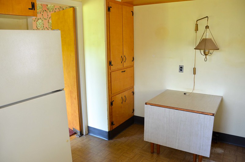
Just a peek at that
sweet, sweet dining room wallpaper. The kitchen, in particular, is true a 1940s vintage
time warp, and while there are lots of cute vintage touches, if you look closely, there's lots of irreperable wear as well (just as in
the dining room). In the original photos above, you can see some of the wear spots in the linoleum floors, and maybe a bit of the peeling ceiling paint, but the sun reflection is too bright to reveal the worn countertops or cracking glass brick mortar.

There's other bits that just don't work: chrome outlet plates, RCA refridgerator from the 90s, frilly curtains, disintegrating door curtain, busted dishwasher, art & craftsman fixtures, dingy trim, the chipped enamel sink, the non-functioning sprayer, paper towel holder over the stove, burn marks in the counters, dark rose cabinet interiors (really), and how just incredibly dark the whole room was. Not to mention how the nook with the folding table just was not working: cabinets facing each other so you can't use them, a large folding table that just collected clutter, nowhere to hang jackets, etc. etc.

Some of this has a quick fix (although, perhaps not cheap): toss outdated curtains, replace curtains, buy new fridge & dishwasher, new lighting fixtures. Others are a longer time commitment, but cheaper fix: paint trim/ceiling/walls, repair chipped enamel. And then some things are a big commitment: replace counters, floors, brighten the cabinets, etc. We did some of these updates in time, but held out on others in anticipation of the BIG REMODEL. But it's been a real
process to figure out what exactly we should and should not do. A budget helps in this regard. No tens of thousands of dollars for a dream kitchen here. Just a more modest 4-digit remodel, well, more of a
facelift. Hopefully to get us through the next ~10 or so years.
There is, however, much of the kitchen that
does work. Like, our beaded cabinet style is so old it
came back in style, and wood cabinets can be painted! The cabinets go all the way up to the ceiling, and there's actually a decent amount of storage in these cabinets. Glass bricks are coming back in style, according to
Domino Magazine, and it also lets in a bit more light. There's quirky vintage details, like a thermometer wired to the indoors and outdoors, and that 50's cornice board over the sink, which
I've removed from elsewhere in the house I find to be a charming vintage touch. The layout of the kitchen generally seems to work for us, too.

Photo by Tanya Lacourse c/o Aparthmenttherapy.
A long time ago (circa 2012), I fell for
this kitchen (full post is available via
WaybackMachine/Apartmenttherapy. The two-tone cabinets, the [relative] cost effectiveness...it just seemed cheery and bright without losing all of the character of the vintage kitchen (although, perhaps not
some of the later changes). And so, that's where we start, with ideas that began churning 10 years ago.
Done! |
Nook Lower Cabinets |
Window Staining |
Staining Open Shelves |
Countertops |
Ceiling Light |
Temporary Storage |
Painting Cabinets |
Window Stripping |
Nook Demo |
Nook Design |
Details |
Ideation |
Inspiration


1 comments:
Oh wow, I didn't even notice the glass bricks the first time around - they do let in a lot of light. I've been considering a mini kitchen remodel this winter as well. We have a great kitchen but the fridge space is for an apt sized fridge. We could slightly alter the lay out - I just need the motivation to get moving on it!
Post a Comment